
40 Best Optometry Websites
Optometry is all about precise vision. An optometry website should be visually pleasing and convey information precisely. If your website is an eye-sore, visitors aren’t going to stick around long enough let alone trust you to help them achieve precise vision.
Do you have an optometry practice and looking to bring it online or revamp it’s online presence? Looking at well-designed optometry websites is a great way to get ideas for your own site. Below are 40 best optometry websites that nail web design for optometry businesses.
Optometry Web Design Inspiration: 40 Best Optometry Websites
Lens Crafters
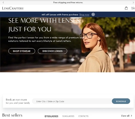
URL: https://www.lenscrafters.com/
With more than 1000 physical stores, Lens Crafters are among the best in their game. Their website is optimized to help you choose the best lenses for your vision needs. Although they feature a lot of information on their main page, they use terrific font and color choices and incorporate plenty of white space to ensure the site isn’t overwhelming. Whether a visitor wants to shop eyewear, find a location near them, or book an eye exam, this optometry website makes it easy it all easy.
CCRS Clear Vision

URL: https://ccrsclearvision.com/
As an UCL and LASIK surgeon, it’s very important for Dr. Paul C. Lee to establish credibility with his website. He does so exemplarily by outlining his credentials right away. This web design inspires confidence and trust in his clinic. The photo presents him as a friendly and approachable eye doctor while the free consultation is a powerful call to action. With the presentation of the services offered and technology used and by presenting an FAQ and testimonials section, the site does an incredible job of empowering patients with information. Definitely one of the best optometry websites you will come across.
Manneye Institute

URL: https://www.manneye.com/
Manneye makes excellent use of their hero section with a slideshow of articles. We especially love the link to their doctors’ own LASIK stories. A great way to connect with people considering LASIK. Using images to present the services offered and procedures carried also works great for the site. To establish credibility, they’ve featured their eye surgeons and impressive ratings. As you scroll down, you’ll find everything else you would want to know from the location to the operating hours.
730 North Optometry
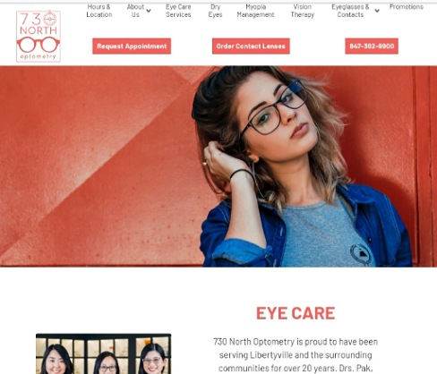
URL: https://www.730northoptometry.com/
For a practice that’s both a vision care center and an eyewear retail shop, it makes sense to divide the site into three sections: vision care, vision therapy, and eye wear. Visitors can simply click on what they’re interested in. We love that the top navigation offers quick links to topics and how their call to action buttons stand out and draw the eye. We love how they make use of both text and images and include testimonials and reviews to take care of social proof.
Cameron Optometry
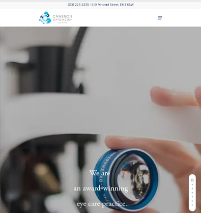
URL: https://cameronoptom.com/
Here is an example of modern web design for an Optometry practice. Clean and minimalist. Using a slider is a great way to present a lot of information without overwhelming the eye. Every scroll reveals details about the clinic from what they do, the products they offer, to their team of eye doctors. Alternatively, you can click on the hamburger menu and go straight to the page you’re interested in. Off course, the location and phone number are easily accessible in the header section.
Lifetime Vision Care
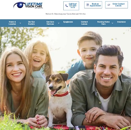
URL: https://www.lifetimevisioncare.net/
Thanks to the hero image, you can tell right away that Lifetime Vision Care serves the whole family. Their web design presents all the information people want to know and makes it easy to schedule appointments or buy contact lenses online. First time visitors also get to learn about the practice, the services offered, and meet their eye doctors. The main pages ends with links to their blog posts and reviews.
Eyre Eye Centre

URL: https://www.eyreeyecentre.com.au/
Brand consistency is one of the best ways to inspire trust. Eyre’s website design is an excellent example of an optometry website that reflects the brand. Their office and website have the same look and feel. This is thanks to the orange scheme and plenty of white space that lends a clean and vibrant atmosphere. Great copy on what sets them apart. Last but not least, the site offers comprehensive contact information for each of their locations.
Georgia Vision Center
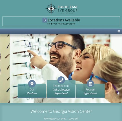
ToURL: https://gavisioncenter.com/
Thanks to impeccable organization, Georgia Vision Center’s website is visually appealing and efficient. It clearly provides all the information a patient might need in order to book an appointment. Locations and services are easily accessible and the meet the doctors section is a great way to establish credibility. A phone number and request appointment buttons make it easy to book a visit right away.
Eye HealthIst
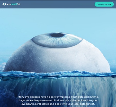
URL: https://www.lookdeeper.com.au
Eye Health1st certainly takes a unique, creative approach with their site design. The main image grabs attention and communicates what the site is all about right away. They also utilize animation and smooth transition effects as users scroll down the main page. What’s more? Their copy is also creative and effective and the call to actions are spot on.
Warby Parker
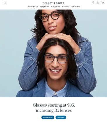
URL: https://www.warbyparker.com/
Warby Parker’s site is the epitome of clarity. Plenty of white space and clean and crisp font styles lend the site an airy feel. High-quality images illustrate their services while creative product pages highlight their products and make it easy to decide what to buy. A great example of how to add an ecommerce store to an optometry website. Lastly, the footer offers quick access to every page on the site.
Pro Optic Eye Care
URL: http://prooptixeyecare.com/
Pro Optic Eye Care web design makes a fantastic first impression. The website portrays a state of the art eye care practice. It has a stylish, modern vibe. The equipment shown is top-notch, and it even features designer eyewear brands. On top of this, all the essentials of great optometry website design are present. From clear navigation, prominent call to actions, to social proof.
Perspective Family Eyecare
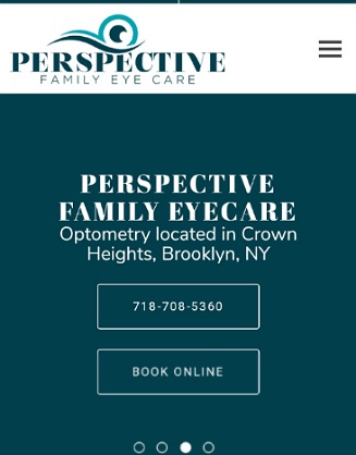
URL: https://www.perspectiveyes.com/
Perspective Family Eye uses their hero section to present the most important information: where they’re located, their phone number, and a link to book online. Next are reviews from patients and then their about us story. As you scroll down, you will encounter a video, a list of the services offered, more testimonials, and confirm whether your insurance provider is supported. Great choice of typography makes readability a breeze.
Eyepic Eye Care
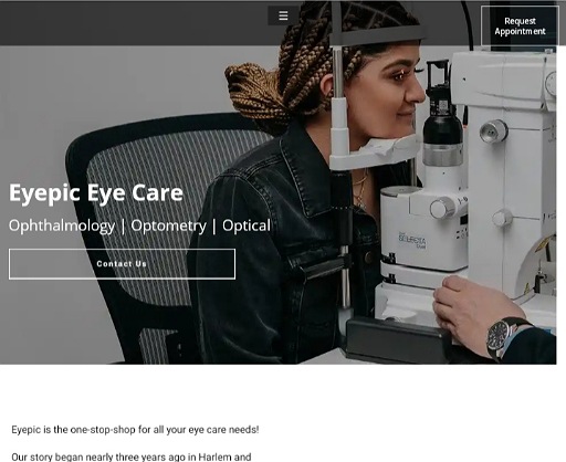
URL: https://www.eyepiceyecare.com/
Eyepic Eye Care makes the most of the hero section by using an image slider to showcase what they do and the top-tier equipment they use. They also include a contact us button to offer a quick way to get in touch. The header is minimal, featuring only a hamburger menu and a book appointment button. Further down, they use copy, images, and videos to provide information about their practice. Finally, testimonials inspire trust while a map makes their locations easy to find.
Chicago Vision Club
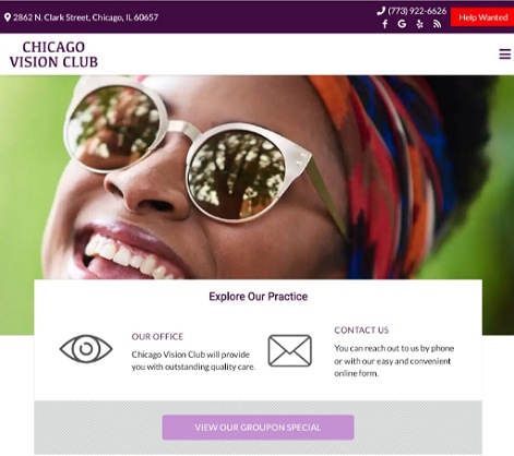
URL: https://optical-chicago.com/
Chicago Vision Club starts by making their contact information loud and clear. They provide their location, phone number, and contact form above the fold. They also feature their social media pages and current promotion prominently. Patients looking to book an appointment don’t even gave to scroll. For first-time visitors interested in learning more about the practice, they have an about us and services sections. The rest of the home page features testimonials, meet our doctors, and operating hours.
JINS
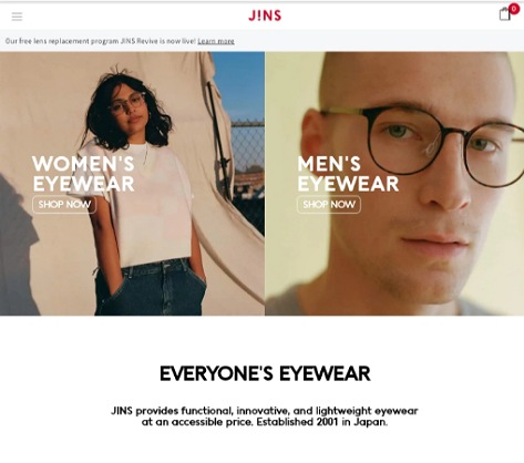
URL: https://www.jins.com/us/
Organization is Jin’s forte. How they present their offerings using a combination of top-notch quality images and clear text makes finding what you’re looking for a breeze. Plenty of white spaces lend the site a clean, airy look and feel. Still, you can access any information you’re looking for from their home page. Their top and bottom drop-down navigation menus lay out links to important pages. Also noteworthy is how fast this ecommerce website loads. You don’t have to wait long to see what they have to offer.
Bay Ridge Family Eye Care

URL: https://www.bayridgefamilyeyecare.com/
Bay Ridge’s web design utilizes the hero section to showcase their state of the art eye care equipment. On top of this image, they use a slider to present their phone number and operating hours. As you scroll down the main page, you get to learn more about the clinic, the team behind it, the services offered, and the insurance they accept. They also feature some testimonials and regularly post informative blog posts. You don’t have to scroll back up to contact them as the footer section also has a clickable phone number, contact us form, and map of their location.
Cohen’s Fashion Optical

URL: https://www.cohensfashionoptical.com/
Here is a stellar example of a website that delivers visual clarity. Everything is amazingly clear from the black text against a white background to the product they offer. Even the black and white photographs are clear. The web design does a great job of communicating what they do while at the same time making it easy to find any product you’re interested in. The only complaint is that they don’t display their contact information on the home page. However, they provide links to schedule an appointment, find a store near you, or shop online.
Richmond Vision Care Optometry
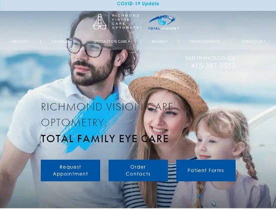
URL: https://richmondvisioncare.com/
The main image and headline communicate what Richmond Vision Care is all about from the get go: providing total family eye care. Visitors don’t have to wonder how to make an appointment as they offer multiple ways to contact them above the fold. The blue and white color scheme lends the site a professional yet welcoming look and feel. As for social proof, they provide a link to their Google reviews page.
Bard Optical
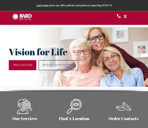
URL: https://www.bardoptical.com/
Bard Optical has kept their web design simple but without sacrificing any of the essential elements. Incorporating plenty of white space gives the site a light feel and you can find everything you need effortlessly. Without even having to scroll, you can learn about the practice, book an appointment, or order contact lenses online. The images are high-quality, the text is clear, and the color scheme and typography ensure readability isn’t a problem.
Buena Vista Eye Care
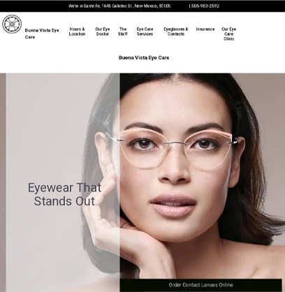
URL: https://www.buenavistaeyecaresantafe.com/
Any visitor looking to get in touch with Buena Vista Eye Care gets the information they need at a glance. This is thanks to the presentation of their physical address, phone number, and hours of operation right above the fold. The top navigation menu is straightforward. New users will also find information about this clinic as well as read convincing testimonials. Finally, they maintain a regularly updated blog that provides helpful eye care information. The footer also features the physical location and links to important pages.
Optikos Optometry

URL: https://www.optikosoptometry.com/
Upon landing on site, visitors are greeted by high-quality images and a clear top menu that offers quick links to all pages. The phone number and scheduling button are clear and accessible so users won’t struggle to find them. Great outline of their services using headlines and short paragraphs. Further down are more ways to contact them including a short form, their physical location, and opening hours.
TLC Laser Eye Centers
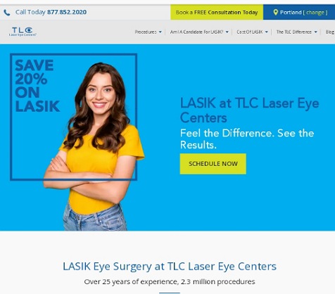
URL: https://www.tlcvision.com/
The most attention grabbing aspect of TLC’s optometry web design is their use of bright hues to draw the eye to the scheduling buttons. A clear menu provides quick answers to the questions a person considering Laser Vision Correction is likely to have. They address the issue of credibility by outlining their impressive experience. Thanks to the use of white space, the web page has a light feel despite having plenty of content.
Dr. Richlin, O.D. & Associates
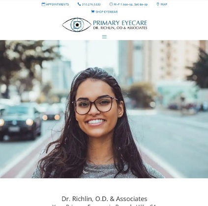
URL: https://www.richlineye.com/
Richlin’s website starts with the most important information. They outline their phone number, location on the map, appointments, operating hours, and shopping links right in the header section. Offering live chat support is another thing that makes this one of the best optometry websites around. Other noteworthy qualities include the great photos, impeccable organization, use of white space, prominent call to action buttons, testimonials, and virtual tour of their office.
Performance Eye Care

URL: https://performanceeyecare.com/
There’s no doubt that this optometrist website performs well. The top navigation menu is simple and clear. The call to action button stands out prominently. And the unconditional one year warranty on glasses no doubt increases conversion rates. You also get to meet their optometrists and see all their locations. Overall, the site is simple but powerful and effective.
Galbrecht Eye Care

URL: https://www.galbrechteyecare.com/
When it comes to great optometry website design, Galbrecht’s site ticks all the boxes. Multiple call to action buttons located in the header section. Patient forms and a patient portal to streamline their operations. The featured photo communicates at a glance that this is a kid and family friendly practice. They even have a pediatric vision care FAQ section. Another noteworthy feature is how their top navigation has links to all the important pages. Finally, a regularly updated blog engages visitors and enhances their SEO.
Cargo Eye Care
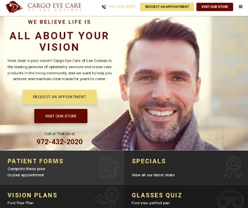
URL: https://cargoeyecare.com/
Cargo Eye Care Las Colinas is the leading provider of optometry services in Irving and their website doesn’t disappoint. First off, a potential customer can find all the information they need without scrolling. They manage to fit plenty of details above the fold and still remain clutter free. Further down the main page is information about their optometrists, links to their vision care services, and testimonials with link to read more reviews.
Walsh Eye
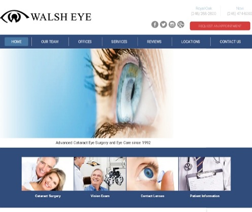
URL: https://walsheye.com/
Walsh Eye has kept their web design short and simple. You can access any information you need at a glance on the no-scroll home page. From their phone number, locations, operating hours, patient forms, services offered, to links to their social media pages. The site is easy on the eyes and easy to navigate through. Images are small without sacrificing clarity. Their efficient web design definitely offers a positive user experience. Lastly, the rich blue colors give the site a calming effect.
Uptown Eye Care
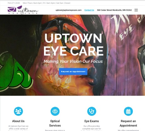
URL: https://www.uptowneyecare.com/
Here is an optometrist website design unlike any other. The name and featured image set this site apart and let you know what kind of practice this is. Their contact details are outlined in the header while an easy to scan list of services gives you a quick overview of what they do. Another feature that makes this web design outstanding is the virtual tour. A selection of testimonials offer social proof. This is a stellar example that you can be different and still effective.
Envision Eye Care

URL: https://www.myenvisioneyecare.com/
Envision uses the most important section of their site to establish credibility. This goes a long way to assure visitors that they’re considering one of the best optometrists in WNC. A schedule an appointment button follows so potential patients don’t have to wonder what to do next. Further down the homepage, you can watch a video, read reviews, and find out their location and opening hours.
North Eastern Eye Care
URL: https://www.neivision.com/
Great choice of background image and slogan. Anyone looking for eye care services knows they’re in the right place. Visitors have multiples ways to get in touch: a clickable phone number, contact form, or find a doctor link. As you scroll down, you get to learn more about this vision care clinic, starting from their establishment date, vision care providers, services, locations, and what former patients say about them.
Derby Laser Vision Center
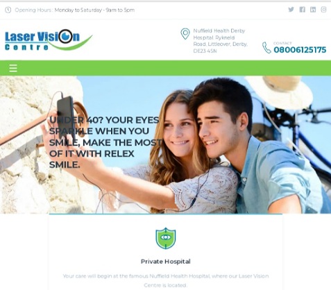
URL: https://derbyeyes.co.uk/
No matter your age you’re, you will feel right at home on Derby’s home on the web. The slideshow on their hero section does a great job of connecting with visitors of all ages. The site also does a great job of assuring patients that they will receive the best vision care in their facility. The header and footer section feature all the critical details potential patients want to know from the location, business hours, to contact information.
Downtown Eyecare and Optical
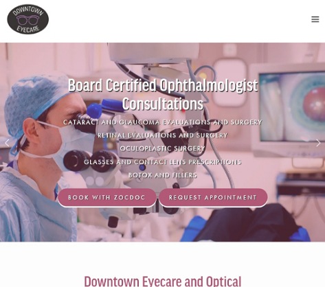
URL: https://downtowneyecareandoptical.com/
Downtown’s ophthalmology website has a calming atmosphere that encourages you to stay and browse around. This inviting feel is thanks to their color scheme and use of white space. The slideshow on the hero section lets you know who they are and what they do. And all you have to do to schedule an appointment is click on one of the buttons or phone number. The site also makes their location clear and you get to meet their ophthalmologists and optometrists.
Smart Optometry

URL: https://www.smart-optometry.com/
The name, tagline, and modern web design all suit what Smart Optometry is all about: delivering innovative digital eye diagnostics and vision therapy solutions. The homepage provides an overview of the services and products they offer with links to learn more. A list of media mentions lends the practice credibility. Last but not least, their blog offers insightful vision care information. Definitely one of the optometry practices to watch now and in the future.
Eye Care Network
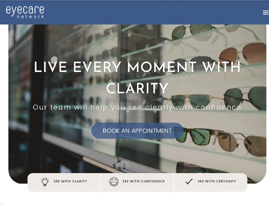
URL: https://eyecarenetwork.com.au/
Easy to read font, eye catching call to actions, and white space are some of the qualities that make this one of the best optometry websites. It’s also a great example of how to incorporate social proof. Mentioning how long they’ve been in business, how many patients they’ve treated, and that they’ve 1000+ five star reviews on Google goes a long way towards getting visitors to trust and consider them. Outlining links to all pages in the footer section ensure visitors don’t have to hunt for information.
Beverly Hills Optometry

URL: https://www.bheyeguy.com/
The best thing about Dr. Silani’s optometry website is how they use images. The high quality images draw the eye and convey the quality of care they deliver. We also love how they use images and titles to list the services and procedures they offer. Outlined in the header section are their contact details and link to shop online. You can even text their team. Sharing their qualifications, testimonials, press mentions, and featuring an award badge does an excellent job of getting visitors to trust them.
Maine Eye Center

URL: https://www.maineeyecenter.com/
Maine Eye Center has also opted for modern optometry web design. The first thing potential patients see are full screen images that introduce what they do. The website does not have a top navigation menu but you won’t feel like you’re missing anything as the website organization seamlessly takes you through everything you want to know. As you start to scroll down, an introduction of the practice is followed by a list of their services, links to all pages, and finally comprehensive contact information including a fax number.
ReVision Optometry

URL: https://revisionoptometry.com/
ReVision is a specialty optometry practice that specializes in treating keratoconus, and other complex eye conditions that need specialized contact lens. It’s a good thing that the introduction lets visitors get to learn this right away. Right below that is an introduction to the clinic and more about their services. Thanks to the map and pictures of the exterior of their office, you won’t have a hard time locating this clinic. The footer section has a contact form, contact information, and a straightforward navigation menu.
Wolfe Eye Clinic

URL: https://www.wolfeeyeclinic.com/
Wolf’s website design presents a lot of information above the fold. This is a good thing as you can locate whatever information you need quickly. It’s also good that the site still manages to steer clear of a cluttered look and feel. Great use of color scheme too. Further down the main page, you’ll learn that the practice has been around for 100 years, read some testimonials, and meet their eye doctors. Great way to assure people about this being one of the best eye clinics. Their locations on a map and photos of their office guide patients to their physical offices.
Vision Source Studio 20/20
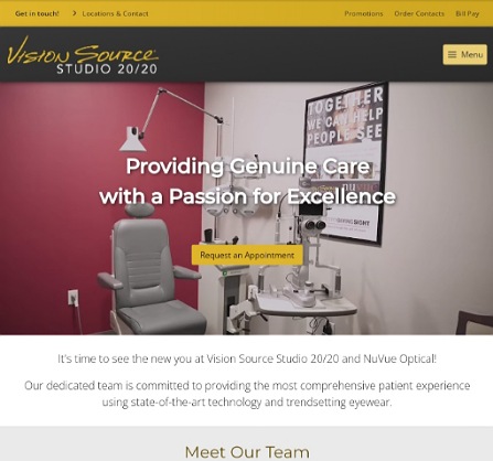
URL: https://visionsource-studio-2020.com/
Utilizing the hero section to showcase a virtual tour of the interior and exterior of this vision studio is a great idea. All the important links are featured at the top of the website. You then get to meet their team of optometrists and learn about the services they offer and designer brands they carry. Short and sweet web design but without sacrificing any of the important elements.
See Saw Seen Eyewear
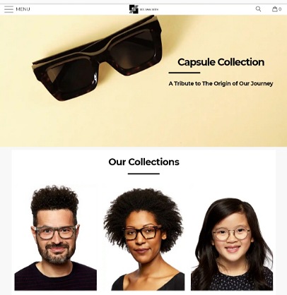
URL: https://seesawseeneyewear.com/
Wrapping up this round up of the best websites for optometrists is See Saw Seen’s site. When it comes to ecommerce eyewear websites, this web design is a stellar example of how to present different products for sale. It’s easy to find what you’re looking for and order it online. A selection of testimonials speak to their quality and service. And the footer section offers quick links to product categories and pages. All these qualities come together to ensure an amazing user experience.
What Makes Good Optometry Web Design?
Let’s now take a look at what makes the above optometry website designs attractive and effective. As you design or redesign a website for your optometry practice, follow these optometry web design best practices to create a website that reflects your brand and offers a great user experience.
Visually Pleasing Web Design
First impressions are powerful, especially when it comes to an eye care website. Your web design has the power to lend credibility to your practice.
What visitors see should impress them enough to want to learn more about your practice and consider your services and products. If your website is an eye-sore, visitors will quickly hit the back button and visit your competitors’ websites.
The best way to create an attractive website is to keep it simple and use stunning photography to catch the eye.
Include only elements that further the purpose of your website and incorporate plenty of white space. Complexity turns off website visitors, as too many elements are distracting and overwhelming.
Provide Crucial Information
People visit an optometry website looking for information about the practice. An optometry site should present visitors with precisely the information they need before booking an appointment.
The first thing visitors to your website will look for is your contact information. Help then find this information right away by displaying it in the header section.
List all the different ways people can get in touch. Display links to your social media accounts in the footer section. Installing a live chat feature can also boost conversions.
Use engaging descriptions, easy to scan lists, and eye catching photography to communicate who you are, the services you offer, where you’re located, your operating hours, the brands you carry, and the supported insurance providers.
Establish Credibility
The purpose of a website for an optometrist is to assure potential patients that they will get top notch quality eye care.
You can do this by introducing a team of friendly professionals, featuring state of the art equipment, showcasing awards, certifications, and media mentions, and publishing articles that demonstrate your expertise.
Testimonials are also a potent tool to inspire trust and convert visitors into patients. You can feature snippets of testimonials from satisfied customers and provide a link to more reviews of your services.
Use Strong Call to Actions
Call to actions are powerful and an effective way to get visitors to deliver your most wanted response. Effective optometry web design makes it easy for potential optometry patients to schedule an appointment effortlessly.
It prominently displays the phone number and scheduling button that leads users to an appointment setting page. Patient forms are also a great way to streamline operations while also improving the user experience.
Use Images and Other Visual Cues
Blocks of text without visual cues can get visitors’ eyes tired and turn them off from considering your practice. Using images, illustrations, animations, videos, and infographics is a great way to present information without overwhelming users.
Whether you’re describing services and procedures or introducing your staff, use high quality visual elements. They will not only make your website more attractive but also improve the user experience.
Clear Navigation Structure
Good navigation is an essential feature of good optometry web design. It helps visitors get to the information they’re looking for easily and quickly. The last thing you want is for visitors to get frustrated and leave because they can’t find what they need. The top navigation menu should be simple and clear. It’s also a good idea to provide links to the most important pages in the footer section.
Consistency with the Eye Care Brand
Your website should be a reflection of your eye care brand. This ensures the customer will have a coherent experience from the website to the physical premises. The design of your website should be consistent with your brand aesthetics. Use the same logo, color scheme, typography, and tone across all your marketing materials.
Responsive Web Design
With more than half of internet users using mobile devices to access the web, responsive web design is a top priority for all websites. Responsive web design means that you website looks great on any device or screen size.
Search Engine Optimization
What good is a pretty optometry website if people can’t find it through the search engines. Optimizing your website for the search engines is the best way to ensure your website shows up on the first page of search engine results pages.
Find out the key phrases optometry patients use to search for an optometry practice in your area and optimize your website content and blog posts for these keywords.
Informative Blog
The highest ranking optometry websites have a regularly updated blog that educates the target audience. Blog posts enhance the search engine rankings and drive the target audience to the website. They also engage potential patients by offering crucial eye care information. Share your articles and infographics on social media to increase engagement and attract more users.
It’s a Wrap!
The above are just a few examples of what great website design for an optometry website looks like. All the sites are attractive, engaging, informative, and user-friendly. Whether you’re launching or revamping your site, draw inspiration from these examples and follow optometry web design best practices to design an optometry website that that attracts your target users, impresses them, and converts them into customers.