40 Best Contractor Websites – Examples of Great Contractor Web Design
Are you creating a new website for your contractor business or revamping an existing site? Looking for ideas and inspiration for beautiful and effective contractor web design? You’ve come to the right place.
We’ve compiled a roundup of the very best contractor website examples to inspire you. These sites are not only attractive but also nail the elements of great contractor web design.
Keep scrolling to discover the top performing contractor websites, learn what makes them successful, and get inspired to create an amazing site for your business.
Effective Contractor Web design: 40 Contractor Website Examples to Inspire You
New Age Home Construction and Remodeling
URL: https://newagehomeconstruction.com/
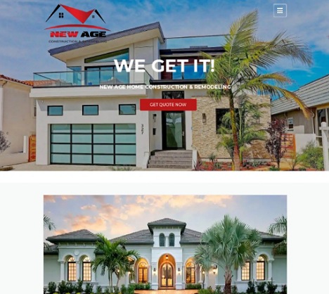
This is one of the most beautiful contractor websites you will come across. From the name and project images, it’s clear that New Age is all about modern remodeling projects. If this is what you’re looking for, you can get a pricing estimate by clicking the prominent get a quote button. Simple yet effective copy describes what the company does and how they work.
Featured clients and testimonials go a long way towards establishing trust and credibility. Great use of bright colors to make the call to action buttons stand out. Finally, the footer section presents all the important information including links, contact details, and working hours.
Goldenline Construction, INC
URL: https://www.goldenlineconstruction.com/
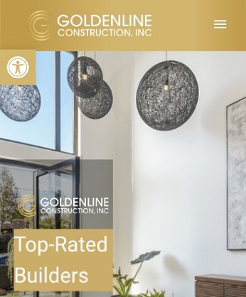
Here is a simple yet powerful contractor website. The design makes the most of the hero section with a video featuring a variety of projects. This is a great way to quickly give the visitor an overview of the kind of projects they handle.
A sticky pricing request form ensures potential clients don’t have to wonder how to get in touch. Their copy explains what they do and establishes their credibility. Recent projects are presented by project type and location making it easy for an interested customer to find what they’re looking for.
AP Remodeling INC

URL: https://www.apremodelinginc.com/
Great utilization of the hero section here too, with a slideshow of their best projects. Within a few seconds on the site, the visitor knows what kind of work they can expect from AP Remodeling.
By sharing video testimonials and showcasing their ratings on third party review sites, this site also does an awesome job of building trust and credibility.
Great projects gallery showcasing their renovation skills and expertise. A sticky footer keeps the projects link and call and email button always visible. Live chat customer service is also a great way to capture leads.
United Elite Group
URL: http://www.unitedelitegroup.com/
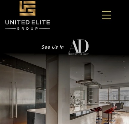
Attractive and inviting, United Elite Group’s website delivers a fantastic user experience. This is thanks to clean modern web design and attractive featured projects. Simple and clear navigation makes it easy to navigate to any page you’re interested in and find the information you’re after.
They share their story and approach and feature client testimonials to deliver social proof. The neutral color scheme works very well for the site. Overall, this is an example of a contractor website that makes a great first impression and gets visitors to linger on the site and explore more.
Divine Builders

URL: https://roomaddition.la/
This is simple and clean contractor web design at its best. This website presents a lot of information on the main page. However, their presentation makes the information easier to digest. Each scroll reveals a slider with easy to digest chunks of text and high-quality images.
A sticky header keeps their phone number, menu, and social media buttons visible as you scroll through the site. By the time you’re done scrolling through the homepage, you will have all the information you need including their approach and what past clients have to say about their services.
Advanced Builders and Contractors
URL: https://www.abclosangeles.com/
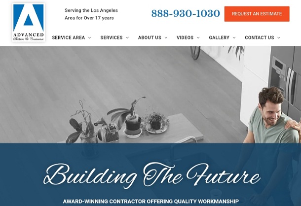
It’s clear that ABC is one of the best contractors in Los Angeles. They convey this impression by proudly stating the number of years they’ve been in business, that they’re an award winning contractor, and with genuine written and video customer reviews.
High-quality images and videos attest to the quality of their work. There’s a lot of text content but this is well-organized so it doesn’t overwhelm. Great branding too with the blue and white color scheme and fonts choice. Last but not least, their phone number and request an estimate button are prominently featured in the header section.
Future Vision Remodeling
URL: https://www.futurevisionremodeling.com/
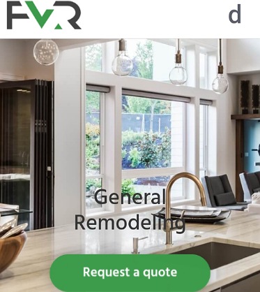
Future Vision’s clever contractor web design is among the best of the best. Right below the header is a slideshow that lets you know the kind of services they offer and the kind of results they deliver. The company story is presented in video format so you get to meet the founder while also learning about the company.
A list of recognizable brands they work with, client testimonials, and links to reviews on third party sites show potential clients that this is a trustworthy contractor. Lastly, the request a quote and free consultation buttons encourage visitors to get in touch.
Pathway Design + Construction
URL: https://pathwaydc.com/
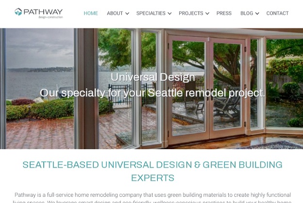
For an eco-friendly remodeling contractor, Pathway’s web design is spot on. The clean design and color scheme suit their smart and wellness approach. Quality photographs speak for their expertise while the neon green call to action buttons stand out.
The site does a fantastic job of building trust and credibility by showcasing their affiliations and partners and sharing testimonials. Another noteworthy feature is that they embed their Instagram gallery on the site. This showcases their latest projects while also promoting their account.
United Republic Construction

URL: https://unitedrepublicconstruction.com/
We love how United Republic articulates what makes them different from other contractors. The projects they feature on the site are also impressive and attest to their capabilities.
A gallery gives a quick overview of the services they offer while a short blurb informs visitors that the firm has been around for 3 decades, which inspires trust. Finally, a schedule your free estimate throughout the page encourages interested clients to contact them.
Apex Transformations

URL: https://www.apextransformations.ca/
Apex is all about Innovation and luxury and their contractor web design displays this. The black and white color scheme lends the site a sophisticated look and feel. High quality photographs speak for their quality workmanship while mentioning their 1992 establishment shows they can be trusted.
Our of our favorite features of this site is the comprehensive FAQ section right on the homepage. It answers questions and addresses concerns visitors might have. Once a potential clients is ready to move forward, full contact details and obvious get a quote buttons ensure they can do so with ease.
Oasis Builders

URL: https://oasisbuildersinc.com/
Anyone looking for high-quality remodels will be impressed by Oasis Builders. Their website is as high-quality as the example projects they display. The hero section offers visitors an option to view their projects so they can know right away whether Oasis is the right fit for their remodeling needs.
Their featured projects, contact details, services and process presentation are all on point. Client stories, awards, and achievements do a great job of promoting trust. Lastly, the dark blue and white color scheme works great for this site.
Jova Construction
URL: https://jovaconstruction.com/
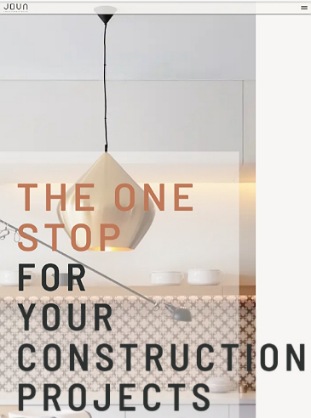
From their color scheme to how they outline their process and unique selling points, Jova’s web design stands out from other contractor websites. We love how they’ve infused their fun personality into their copy, portraying then as friendly and a delight to work with.
Their portfolio speaks for itself, while their client list and detailed testimonials go a long way towards convincing prospective clients that this is a reputable firm they can trust to deliver. However, there’s room for improvement as their homepage lacks call to action buttons. They only list their contact information in the footer section.
Maya Construction Group
URL: https://mayaconstructioninc.com/
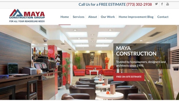
When it comes to establishing trust and credibility, Maya have done an excellent job. Potential clients learn that they’ve been around since 1998. Furthermore, they share a testimonial from the Steve Harvey Show and link to their reviews on third party review sites.
They also assure interested visitors that they’re going to deal with the owners of the company. We love how they use an FAQ to answer the questions visitors might have before hiring Maya to handle their projects. Lastly, offering a free on-site estimate is one of the best ways to drive interested customers to get in touch.
McCullough Construction
URL: https://www.mccullough-construction.com/
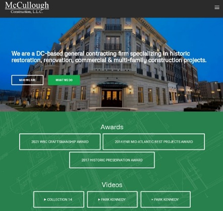
We love how this web design uses visual cues (images and videos) to showcase their projects and services. And the featured projects look good and do a fantastic job of selling their services. Thanks to the hero copy and images slider, potential customers can tell at a glance what this contractor does.
The featured awards serve as credibility and trust signals. Further down are press mentions and customers reviews to reinforce trust. Last but not least, their use of color to organize their website and make the call to action buttons stand out works really well.
Monumental Contractors
URL: https://www.monumentalgc.com/
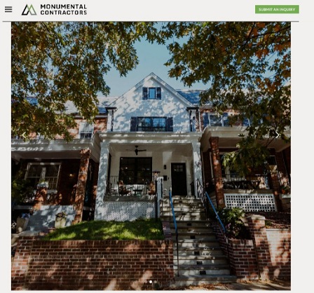
Monumental contractors have a short and simple yet effective site. They know exactly what to include on their homepage to impress visitors, capture their attention, and pique their interest. The featured slideshow speaks to their skills and expertise while the logos of their affiliations depict the firm as professional and trustworthy.
In addition, this site is an excellent example of how to incorporate a blog into your contractor website. Choose relevant topics that offer value to your target customers or address their concerns and use high-quality images to capture attention. Lastly, you don’t have to wonder where to find information or how to get in touch as they include clear menus and contact details on both the header and footer.
Chi Renovation and Design

URL: https://www.chirenovation.com/
Chi’s site has such a clean and airy feel. This is thanks to how they incorporate plenty of white space into their design. Their typography and color scheme also help achieve the modern look and feel. Another benefit of this simple presentation is that it’s very easy to explore the site without feeling confused or overwhelmed.
This definitely helps visitors linger on the site and respond to the obvious call to actions. Another feature that sets Chi’s site apart is their use of video to present customer testimonials. Everything else is top-notch from the hero area, pro-tier photographs of their work, clear copy, locations served, to contact details.
J&E Modern Construction
URL: https://je-mc.com/
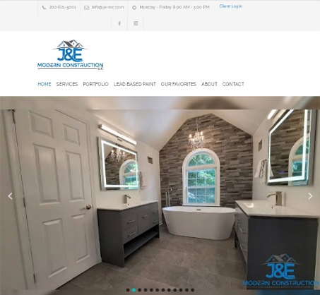
The first thing you see when you land on this site is a variety of completed projects that demonstrate their diverse capabilities.
Their copy serves both human visitors and search engines. It spells out who they are, what they do, lays out their selling points, and addresses the concerns potential customers are likely to have.
As for search engine optimization, they’ve optimized their copy with targeted keywords aimed to have their site show up high in the search engine results page for searches in the locations they serve. Their navigation layout, testimonials, and contact information are also spot on.
Crescent Builds

URL: https://www.crescentbuilds.com/
Crescent Builds’ contractor web design has an airy look and feel that makes the site a joy to browse through. All the information it takes to decide whether this is the right contractor for you is covered.
On the homepage is a list of the services offered with links to dedicated service pages. You also get to learn their approach and core values, and read customer reviews.
Featured projects are described by type and location so you can easily find relevant projects to explore. Great use of the footer section with links to important pages and detailed contact information including their physical address.
Model Remodel
URL: https://modelremodel.com/
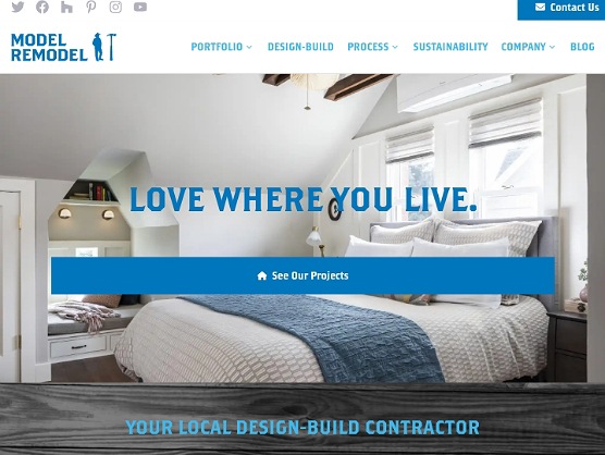
This remodeling web design maximizes their above the fold real estate. Without scrolling down, you can learn what the company is all about, the kind of projects they handle, and even see their recent projects. A straightforward navigation menu and links within the content quickly take you to the most important pages for a contractor.
Trust signals are also spot on, with projects completed, awards won, and testimonials. Further down, you’ll find a list of the locations they serve plus blog posts offering remodeling tips. The blue and white color scheme lends the site an attractive modern feel.
Eakman Construction
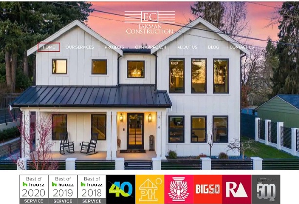
URL: https://eakmanconstruction.com/
Eakman has done an excellent job when it comes to building trust and credibility with their website. Right upon landing on the site, you can see that this is a reputable contractor with multiple awards under their belt. The featured video gives a quick overview of past projects, helping future clients gauge the quality of their work.
Next, they share their values and process to inform potential clients what to expect. As you scroll down further, you’ll learn about their services and read valuable blog posts. The sticky top navigation and contact and social media buttons remain visible throughout.
IOR Construction
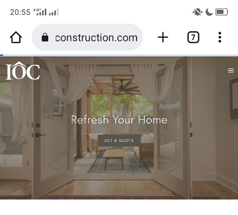
URL: https://www.iorconstruction.com/
We love how IOR construction explains their process. Anyone interested in their services gets a clear idea of how they work. They share plenty of impressive projects right on the homepage, which is an effective way to sell their services.
Embedding glowing reviews from Yelp, a third party review site, tells visitors that this is a contractor they can trust. Throughout the page, a get a quote or get started call to action button ensures potential clients don’t have to wonder what to do next. The main page ends with a list of their services and locations served.
CB Construction
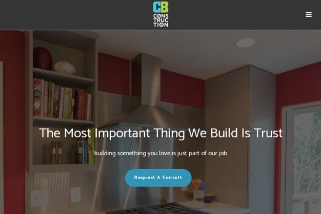
URL: https://www.cbconstructionnw.com/
CB Construction’s web design has impeccable organization. They pack quite a lot of content into their home page but without it resulting in a cluttered look and feel. True to their slogan, their website does a great job of building trust.
They share their mission, approach, clear process, and beautiful projects they’ve completed. Descriptive testimonials from satisfied customers top it off. You also get to meet their team and learn their qualifications. Finally, prominent call to action buttons and a simple contact form offer a way to get in touch.
Hannegan Construction
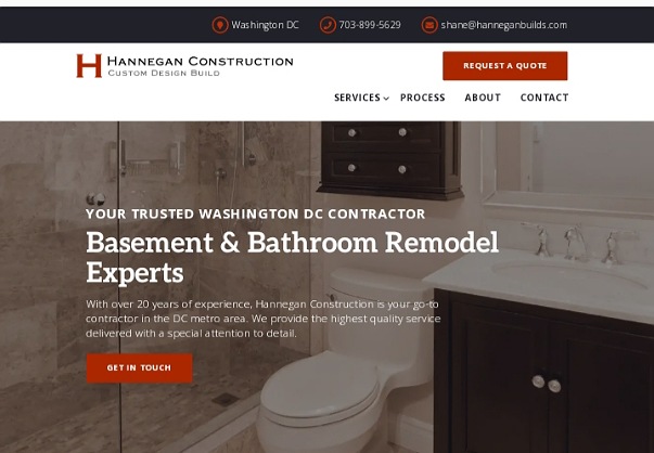
URL: http://hanneganbuilds.com/
Hannegan specializes in bathroom and basement renovation and every element of their web design makes this clear. This helps set them apart from other contractors and positions them as experts in their specialties. Mentioning that they have over two decades of experience positions the company as credible and trustworthy.
Moreover, their portfolio images and customer reviews attest to the quality of their work. If you’re impressed and would like to proceed further, the header section lists their phone number and email address and there are plenty of compelling call to actions throughout the main page. Finally, bright color accents draw attention to the important areas.
Cannon Construction
URL: https://cannongroup.com/
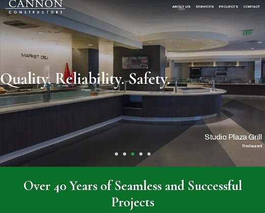
Cannon’s home page is short yet comprehensive. It displays their best projects and outlines the services their offer with links to dedicated pages for each service. A simple navigation menu offers quick links to their projects, services, about, and contact pages.
Knowing that the firm has been around for more than 40 years is confidence inspiring. Last but not least, the footer section provides comprehensive contact details for all their locations. Clearly, you don’t need a long website to satisfy what visitors are looking for.
Sunny Development Group
URL: https://sunnydg.com/
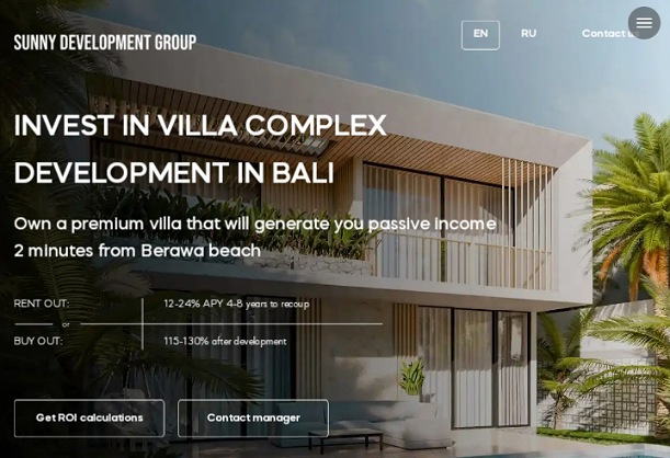
Sunny DG specializes in Villa development in Bali. As such, their call to actions are different from other contractors websites. They know that potential investors are interested in consulting with an expert and finding out the return on investment.
Their CTAs address these two intentions. The website also outlines the reasons why real estate in Bali Island is a great investment. You can see the kind of projects they construct, the locations they build in, and how their process goes. Overall, the site portrays them as professional and trustworthy.
Groesbeck Construction

URL: https://groesbeckconstruction.com/
It’s a great idea to use the valuable real estate in the hero section to present the services offered accompanied with copy and images. This way, visitors know right away whether the contractor offers what they are looking for.
Right below the hero image slider, Groesbeck establishes their unique selling proposition by outlining the top reasons to choose them instead of any other construction company. You also have to agree that the branding (typography, color scheme etc.) suits a renovation company that serves commercial clients, colleges and schools. Lastly, their book a free consultation call to action is spot on.
The Ultimate Pro
URL: https://www.theultimatepro.com/
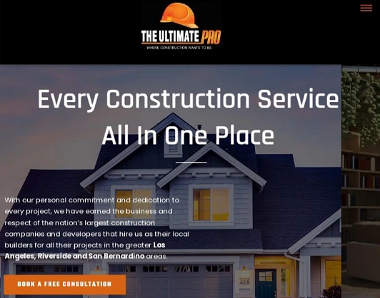
It’s clear what The Ultimate Pro does and where they do it. Mentioning the locations they serve enhances their chances of appearing for local searches. One thing that sets them apart is that they have a YouTube channel that they promote on their website.
Also noteworthy is how they use stats to inspire trust and how they provide full contact details including a map of their location right on the homepage. Finally, their book a free consultation offer highlighted in attention-grabbing orange hue is hard to miss.
JL General Contractors
URL: https://myfixitguys.com/
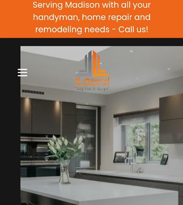
Our favorite thing about this web design is how they use their hero section to convey the services they offer while also showcasing some of their work. The language used is simple, clear, and effective.
It’s clear what the company does and which locations they serve. The visuals are high-quality and the orange call to action buttons are obvious against the white and grey background. All other aspects of great web design including navigation, reviews, and contact details are present.
Siena Construction
URL: https://sienaconstruction.com/
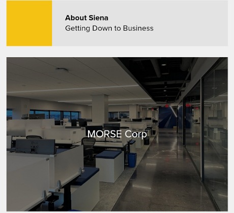
Siena does an excellent job of showcasing the different contractor services they offer. Right on the main page, they present images of the different kind of projects they can handle. This presentation gives potential clients a clear idea of what they do.
Furthermore, they have published blog posts of some projects to demonstrate what they do and how they for it. They also explain who they are and share their address, phone number, and email address in the footer section.
123 Remodeling
URL: https://123remodeling.com/
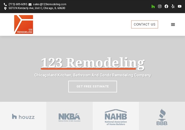
This remodeling web design presents the most important information right away. The hero section establishes what they do and where. The header section has comprehensive contact details including their physical address and links to social media accounts.
They also establish their credibility right away by featuring their affiliations. If you’re sold, you can click on the contact us or free estimate button. All the above without having to scroll. But if you’d like more information, you can explore further down to see their portfolio, and learn about the company, their process, and what past customers say about them.
McCARTHY
URL: https://www.mccarthy.com/
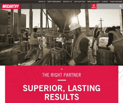
McCARTHY takes a people-centric approach with their construction website. They understand that it takes the best workers to deliver superior results. Most of the photos on their main page showcase their high-performing team at work. The bright hue is great for branding as it sets them apart from other commercial contractors. Text is kept minimal but the message is still clear. Plus the top navigation menu offers quick links to all the other pages.
The Kitchen Master
URL: https://www.thekitchenmaster.com/
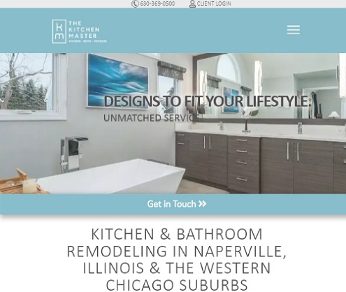
For a kitchen and bathroom remodelling contractor, the light blue and white color scheme is right on point for The Kitchen Master. The photos featured on the site showcase quality projects and attest to their expertise. Clients know exactly what to expect thanks to the overview of their 7-step process. Established in 1977 and having hundreds of positive reviews, there’s no doubt about their credibility. Lastly, a prominent phone number and easy to fill form make it easy to get in touch with the company.
Innovate Design-Build
URL: https://innovateatlanta.com/
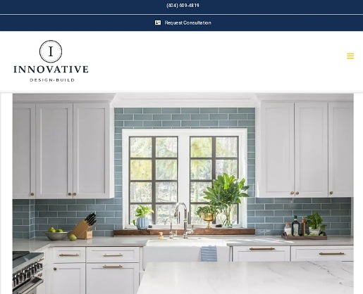
Innovate Atlanta has a light and clean look and feel. This is thanks to their color scheme and incorporating plenty of white space. High-definition photographs showcase their remodeling projects in the best light. Descriptive testimonials accompanied by photos, third party ratings, and warranties do a great job or establishing social proof.
Anyone looking for high-quality remodeling services in Atlanta will feel at home on this site.
Continental Electrical Construction Company
URL: https://cecco.com/
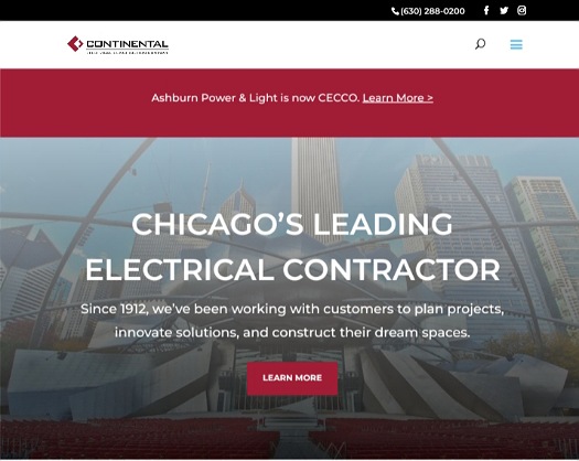
When looking for an electrical contractor, you want an established and experienced company you can count on to maintain the highest standards of quality and service. CECCO’s website does an excellent job of establishing their expertise and credibility. Potential clients learn that the company has existed for more than a century and completed more than 25,000 projects. Their website showcases professional electricians and high-profile clients they have served. All in all, their site is effective at convincing clients to count on them for a complete array of electrical solutions.
Luxe Remodel Design + Build
URL: https://luxeremodel.com/
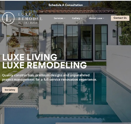
Luxe Remodel’s contractor web design matches the premium designs and top quality work they do. The copy, images of their projects, and testimonials are all on point. You can also easily tell what services they specialize in. Getting in touch with the firm is easy. Simply fill and submit a simple contact form to schedule a consultation. On top of this, they provide a physical address and phone number for each of their three locations.
Modern Trend Tiling
URL: https://moderntrendtiling.com.au/
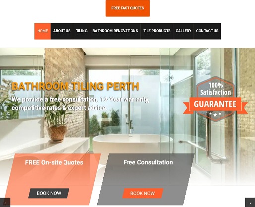
Generating business online is all about trust and Modern Trend Tiling understands this perfectly. The main section of their website is dedicated to giving visitors reasons to trust them. Couple this with free consultation and on site offers and there is no doubt that their website does a great job of generating leads. Besides communication what they and how they do it, the site clearly conveys their unique selling points and benefits of hiring this particular tiling contractor. We love how they use a bright orange hue to highlight their contact details and calls to actions.
SOD Home Group
URL: https://www.sodhg.com/
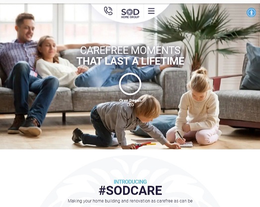
SOD aims to make the building and renovating experience as carefree as possible. Their website goes well with this approach. The design feels light and welcoming and addresses uncertainties right away by offering warranties and other peace of mind guarantees. This sets SOD apart from other contractors. They use videos to share knowledge and showcase their process. Last but not least, potential clients can get a quotation within minutes.
Diamond Finish Concrete
URL: https://dfconcrete.com.au/
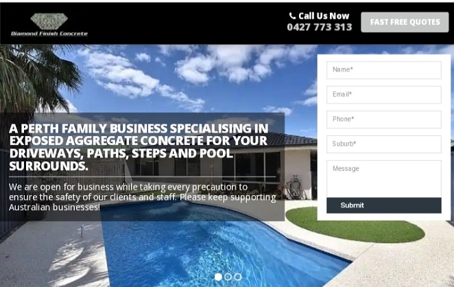
From the color and font choices to the content, DF Concrete’s website ticks all the boxes that great contractor web design should. Their main page outlines their services, communicates the value of hiring them, showcases their work, and features select testimonials. All these without overwhelming the visitor. A clickable phone number and easy to fill quote request form encourage potential customers to reach out.
Adair Homes
URL: https://www.adairhomes.com/
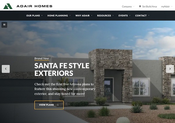
Adair Homes pride themselves on being the largest and most experienced custom home builder in the West. Their website supports this by stating their 1969 founding year and the thousands of homeowners they have served. This house plans and virtual tours encourage aspiring home owners to spend more time on the website. They also offer helpful advice, ideas, and inspiration. The end result is a website that engages potential homeowners and convinces them to trust and give Adair a chance.
Window World
URL: https://www.windowworld.com/
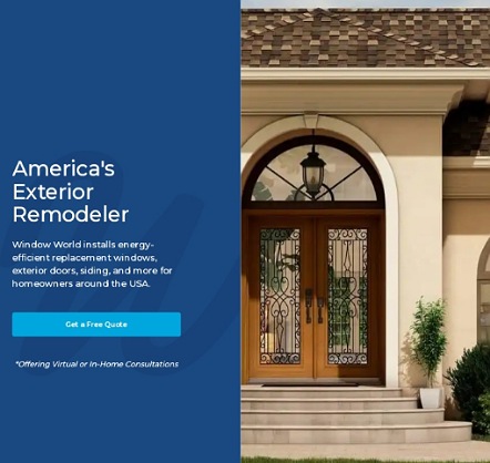
Window World’s hero section is simple but powerful. It features an attractive image, a short description of what they do, and a get a free quote button. Further down, they outline their services and customer satisfaction award. An outline of their process and photos of their team at work tells you what to expect with this exterior remodeler. Offering a free in-home or virtual consultation encourages interested customers to get in touch.
Takeaways from the Top Contractor Websites: What Makes a Great Website for a Contractor?
As takeaways from the above contractor websites, below are the characteristics of contractor web design that attracts the targeted clients, impresses them, and converts them into leads. As you design and build your own website, keep the following in mind.
Clean and Simple Web Design Works Best
As you can see from the above contractor website examples, the most attractive contractor sites adopt clean web design, with plenty of white space in between items.
Keeping things simple lends a site a professional and modern look and feel. It’s no surprise that people trust businesses whose sites have clean web design.
Moreover, a clean website allows the key elements to stand out and makes it easy for visitors to explore the site and complete the desired actions.
Original and High-Quality Images of Projects are a Must Have
Nothing has the power to market your services better than images of impressive projects you’ve completed. Take high-quality photos of your work and sprinkle them throughout your website.
Showcase the best projects that represent what you do on the homepage. Beyond this, have a portfolio page featuring a variety of projects to showcase your diverse capabilities.
You can organize your portfolio by types of projects and locations. This makes it easy for visitors to find relevant projects. It’s also a good idea to have a page for each project and describe the scope of the work you did.
Compelling Content is Essential to Persuade Visitors to Hire You
Potential clients visiting your website expect to learn how you can solve their construction and remodeling problems.
Use the homepage and the about section to explain what you do, how you do it, and what sets you apart from the competition.
Clients are more likely to consider your services if your story resonates with them. Identify their pain points and address them in your copy.
Last but not least, having a blog and sharing helpful information is a great way to connect with visitors while also boosting your SEO efforts.
Individual Service Pages are Vital
Do you offer multiple contractor services? Create a page for each and every service you provide. The pages should explain the services you offer and include images of related projects you’ve completed.
Doing this gives clients a clear picture of what to expect from you and also boosts your search engine ranking and organic traffic. Clients looking for specific services will land on your service pages.
Great Contractor Sites are Easy to Navigate
Ease of navigation is one of the most important features for a website. It has an impact on search engine ranking, user experience, and lead generation.
A clear and logical navigation structure is easy for search engine bots to crawl while human visitors can easily and quickly find what they are looking for. This means less friction to generating leads.
A cluttered and poorly organized site, on the other hand, will frustrate visitors and cause then to leave your website.
You Need Credibility Signals and Social Proof to Build Trust
Credibility is very important when it comes to choosing a contractor. Potential clients coming to your website want assurance that you’re capable and trustworthy. Your web design and content should portray your firm as successful and reputable.
Establish your expertise and credibility by mentioning how long you’ve been in business and showing your accreditations and impressive stats. If you’ve earned industry awards, proudly showcase them.
Additionally, showing testimonials from happy customers and your ratings on third party review sites is the best way to establish social proof. You can also feature logos of high profile clients you’ve worked with.
Search Engine Optimization (SEO) is Necessary to Rank High
The top ranking contractor websites use search engine optimization best practices to rank high on Google and other search engines. This drives free traffic and leads to their websites.
If you want your website to appear on the first page of Google, you’ve to optimize your web design and content for the search engines. This entails using the target keywords in the meta titles, meta descriptions, and body copy.
Additionally, implementing local SEO optimization can make your contracting company more visible on local search results.
Contact Information Should Be Easy to Find
A great website is useless if customers don’t have a way to contact you. Make it easy for interested visitors to reach you by featuring your phone number in the header and footer section.
Even better, you can make the header or footer sticky so the number stays visible as the visitor scrolls down.
Additionally, you should have a comprehensive contact us page that shows your physical address and opening hours, phone number, email address, and contact form.
Displaying social media channels is also a great way to connect with potential customers.
Clear Call to Actions are the Best Ways to Turn Visitors into Leads
The most effective way to shorten the sales funnel by encouraging potential customers to take the desired action is to use clear and relevant call to actions (CTAs).
Make the call to action links and button stand out by highlighting them in a bright color and use compelling language that encourages the customer to click.
Take the time to understand your target customer needs so you can create CTAs that speak directly to them. Examples of effective call to actions for a contractor website include get a free quote or schedule a free consultation.
Consistent Branding Sets Your Site Apart
As a general contractor, your web design is an opportunity to differentiate yourself from other contractors. Your contracting web design should reflect your core business values and brand identity.
Use your branding elements to make your site stand out and also strengthen your branding. You can do this by using the same color scheme, font, and personality as your brand.
Responsive Web Design is a Top Priority
Considering that the majority of people now browse the web via mobile devices, having mobile-friendly web design is a must. However, your site design should still cater to desktop and laptop users.
The best way to deliver a great user experience for all your website visitors is to adopt responsive web design. This way, your website will resize and reorient itself in order to render well on any device.
It’s A Wrap!
As a contractor, your web design has the power to improve your bottom line. When executed well, your website can differentiate your business from the competitors and generate a steady flow of leads online.
Get inspired by the above examples of great contractor websites and get ideas to develop an outstanding web presence for your business.
Do you need help designing or redesigning your contractor website? Our team of web designers and developers can help you create a construction or contractor website that impresses your target audience and wins clients. Contact us today! We will design a custom mockup of your website for free!
