
Examples of Good and Bad Mobile Website Design
The internet is mobile-first now. More than half of web users today browse websites from mobile devices. Even Google’s ranking algorithm is giving priority to mobile-friendly websites. And given that 61% of visitors will leave a website that doesn’t render well on a mobile device, responsive web design should be a top priority for a serious website owner.
Good mobile web design can not only ensure your website ranks high in the search engine result pages but it also ensures that mobile visitors stick around on your site, have a great experience, and convert into customers. Bad mobile design, on the other hand, will have visitors bouncing without looking at your offerings and Google penalizing your site with low ranking.
But what exactly does good and bad mobile website design mean? We’ve presented examples of good and bad mobile websites and also talk about what defines good and bad mobile web design. Read on to learn the best practices to adopt and what mistakes to avoid when designing a mobile-friendly website. Let’s start with poor mobile sites that could desperately use a revamp.
Examples of Bad Mobile Web Design
Yale School of Art

URL: https://www.art.yale.edu/
This website just doesn’t reflect the standard of excellence Yale is renowned for. While it’s obvious that the site takes an artistic approach, it does so at the expense of usability. What makes Yale’s school of Art’s website an example of a bad mobile site design is the lack of consistency in how they present their content.
This information rich website has a cluttered design with the text all over the place and in different fonts, sizes, and styles. All these poor design choices result in a pretty distracting website that’s hard to follow and the content hard to read. Someone browsing from a mobile device will find the website overwhelming and confusing.
James Bond 007 Museum

URL: http://www.007museum.com/
This website just doesn’t reflect the James Bond brand. First of all, the site is a disorganized mess that only manages to overwhelm users. It’s composed of a collection of text and pictures but these are organized in a haphazard way. There’s no navigation structure or visual hierarchy so it’s hard to tell where to start.
Second, the website isn’t optimized for mobile devices at all. The content spills to the side so one has to keep scrolling to the left and right. The text and images are too small and you’re forced to zoom out in order to make out the details. One of the worst websites to browse on a smartphone or tablet. Even the most ardent fans of James Bond are bound to be frustrated by this confusing structure.
Industrial Painter

URL: http://industrialpainter.com/
The Industrial Painter hasn’t adopted responsive design. This information rich website has a cluttered look and feel, even on a desktop computer or laptop. On mobile screen, reading the content requires zooming and then scrolling to the left and right.
To make matters worse, the navigation links are all over the place, forcing one to work hard in order to locate what they’re looking for. This is a missed opportunity to market their services effectively. They should get to the point on who they are and what they do, showcase an impressive portfolio, make it easy to navigate through the site, and adopt responsive and mobile-friendly web design.
Hacker News
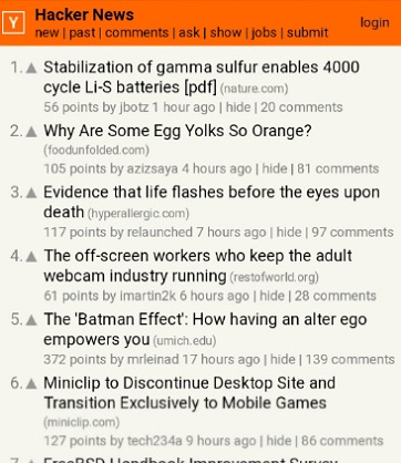
URL: https://news.ycombinator.com/
It’s clear that a attractive web design just isn’t a priority for this popular news aggregator website. It has one of the worst web designs you’ll ever come across in this day and age. The outdated design is neither friendly on a desktop computer nor optimized for mobile devices.
It looks terrible on mobile screen resolutions. The website only features text. No visual cues to make it interesting. Even then, the threads are bundled together, the text font is too small and the color muted resulting in poor readability. It’s necessary to zoom in order to read the text. The website could also use more whitespace to ensure ease of scanning.
Berkshire Hathaway
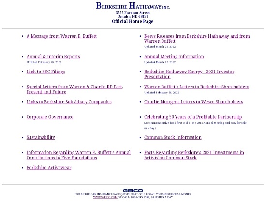
URL: https://www.berkshirehathaway.com/
And here’s is an example of bad mobile web design for a corporation. It’s hard to believe that this outdated site is the online face of a holding company worth billions of dollars. To begin with, the website fails at its core function: to provide information about the company.
The entire site is composed of links to other pages and sites. They don’t even make use of visuals. What’s more? The site isn’t designed for optimum display on a mobile browser. You have to zoom out in order to read the content. The site is badly in need of a modern web design that portrays the brand in its best light and a more visual design that captures attention and holds interest.
Interrupt Technology Corporation

URL: http://itcorp.com/
Interrupt Technology Corporation was one of the very first companies to have a web presence. They registered their domain name Way back on 27, September 18, 1986 and are one of the oldest domain names still register today. Unfortunately, their web design is still stuck in 1986.
And going by their explanation: “This Web page exists primarily to satisfy the needs of those who expect every domain to have a Web presence.”, they have no plans of revamping it. By foregoing modern responsive web design and sticking with a site this uninspiring, they are definitely missing out on an opportunity to maximize their web presence.
Cute Stats

URL: https://www.cutestat.com/
CuteStat has not even bothered with making their website design responsive. When you position the curser to type in or paste the URL of the website you’re interested in, the entire website zooms out so you have to slide the website left in order to access the lookup button.
When the site returns the website stats, reading the information requires pinching and zooming. The site is also too ad heavy which distracts the eye and means that users have to hunt for the information they came to get. Overall, the site looks too busy and distracting on a mobile screen and fails to deliver a good first impression.
Examples of Good Mobile Web Design
Stanford

URL: https://www.stanford.edu/
When it comes to sites for educational institutions, Stanford has done an exemplary job. Stanford.edu is absolutely stunning whether viewed on a computer screen or mobile screen. It portrays a world-class University and manages to right to the footer. It fits well on mobile screens and presents all the important information a university site should without overwhelming or confusing the reader.
Attractive images provide interesting visual clues and makes the site a pleasure to browse. To fully appreciate this modern University web design, compare it to Yale’s School of Art’s site above and see the world of difference in the user experience.
Ryder Used Trucks

URL: https://www.ryder.com/used-trucks
Ryder Used Trucks was the Best Mobile WebAward winner in 2021 and it’s easy to see why. Their website is a shining example of good mobile web design. From the way it resizes and reorients itself to suit different mobile screen sizes to the browsing experience on a smartphone. Great choice of color scheme, visual hierarchy, navigation, and calls to actions.
You can tell what the website is all about at a glance and search for the kind of truck you’re looking for right away. As you scroll down, you find more relevant information that addresses any concerns you might have. Most importantly, the site offers a fantastic browsing experience on a cell phone or tablet. You never have to zoom or scroll sideways to read the text or view the images.
Quay

URL: https://www.quay.com.au/
Quay adopts a clean and sleek web design that looks amazing on any mobile screen size. A sticky hamburger menu keeps navigation links at hand for quick access to any page while a prominent and sticky ‘Make A Reservation” call to action button offers a quick way to book a dining experience.
The pictures are high-quality and large enough white the text is large and readable against the white background. Everything fits on a mobile screen so you don’t have to swipe sideways, pinch or zoom. The design keeps users engaged while the amazing user experience increases their likelihood of making a reservation.
Shell

URL: https://www.shell.com
Shell is an example of a corporation that nails its mobile web design. It delivers a top-notch user experience even on mobile screen resolutions. Their website in an information hub that tells you all about the company and their activities. The brand’s colors are used throughout the site but in a subtle way that doesn’t compromise on usability.
This consistency fosters brand recognition. The hamburger menu and search button come handy as you browse, ready to quickly provide the information you’re looking for. They use bold headlines to organize content and create visual hierarchy. And the font color and size ensure readability isn’t a problem.
Huffington Post

URL: https://www.huffpost.com/
Huffington’s website is an excellent example of a mobile-friendly news site. Not only does their website fits perfectly on mobile screen sizes but the headlines and text are optimized so they are easy to scan or read when reading from a small mobile screen.
Even the way they separate the headlines and the categories makes the site easy to use. Their font colors and sizes also deliver a stress-free browsing experience. To avoid overwhelming users, they also use fewer words on the homepage and plenty of white space. Overall, Huffington has done an amazing job of presenting a lot of content without overwhelming or frustrating mobile users.
Zappos

URL: https://www.zappos.com/
Zappos is known for superb customer service and their mobile website is no exception. Their priority is to ensure that users can easily and quickly find the items they are looking for. They present their latest offers in a clear way and have also made it easy to search for what you’re looking for by featuring a large search bar at the top.
Their website ticks all the other boxes of good mobile web design from responsiveness, readable font, to visual hierarchy. Making a large e-commerce website friendly is no easy feat. How to present all the buying options and pictures on small mobile screens? Zappos is a stellar example of how to accomplish this without sacrificing usability.
What Makes Good Mobile Web Design?
Good mobile web design is optimized for mobile devices such as tablets and smartphones. Not only does it utilize a responsive design that adapts itself to any mobile screen size, but it also has a mobile-friendly user interface with the following features:
- Clear and straightforward navigation structure and visual hierarchy
- Clickable elements such as buttons and links are well spaced out so users can tap on a link without touching others
- The content perfectly fits the size of the screen so users don’t have to scroll left or right
- The color scheme that’s consistent with the brand without sacrificing readability
- Text is large enough to read without pinching and zooming out
- Has a simple menu or uses a two-line hamburger menu to make mobile browsing easier
- Has a search bar placed on the top to make it easier for users to find what they’re looking for
- Uses simple, easy to fill forms with large buttons and text fields
- Does not use annoying popups or automatic audio files
- Passes Google’s mobile-friendly test with zero issues
What Makes Bad Mobile Web Design?
Bad mobile web design, on the other hand, lacks user-centricity. It’s difficult for visitors navigate it, find what they’re looking for, or accomplish what they’re trying to accomplish. Here are the characteristics of poor mobile web design:
- Non-responsive web design that looks the same whether viewed on a desktop computer, laptop, tablet, or a smartphone
- Content is wider than mobile screens forcing users to resort to horizontal scrolling
- Clickable elements like menu items, icons, or links are too close together and it’s easy to tap on the wrong link
- A cluttered layout, non-existent navigation menu, and lack of visual hierarchy
- Font and background color choices that hurt the eyes and hurt readability
- Typography that’s so small that it’s a pain to read
- Website fails Google’s Mobile-Friendly Test
That’s A Wrap!
With more than half of internet visits originating from mobile devices, mobile friendly websites are now more important than ever before. It’s crucial to make sure that your website is responsive and mobile-friendly.
Good mobile web design is user-centric. Users can navigate it with ease, find what they’re looking for or complete the intended action easily. The defining characteristic of bad mobile web design is poor usability.
Are you wondering whether your mobile web design falls in the bad or good category? Simply use Google’s mobile-friendly test tool to learn how mobile-friendly your site is and get recommendations on what to fix to ensure you site delivers a great experience for mobile users.